 |
 KP2000: Learner Interface Redesign |
 |
|
Developed for, and |
SolutionKnowledgePlanet's web-based application has to meet the needs of a range of customers, each with different approaches to learning and performance management. Some customers simply want to manage people's training, while others want a more knowledge management-style solution, and others are focused on competencies and their relationship to goal-setting and performance review. IPGems' challenge was to find ways to make a complex application appear consistent, accessible and not intimidating, while at the same time creating flexible design that could be tailored to meet the needs of different customers. The design goals were:
The major features of the redesigned interface, described below, include:
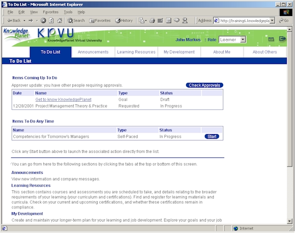
The Learner "To Do" listFor many learners, their use of the application is restricted to monitoring what training courses they are scheduled to take, and accessing self-paced learning in a simple, efficient way. Because they do not use the LMS every day, it is also important to remind them of things that need their immediate attention, such as certifications that must be renewed or library materials that are due to be returned. Prior to the redesign, learners would have to look at lists within each section of the application - there was no central, convenient place to see the status of the activities they needed to perform. The new To Do List brings the information to the learner. The list is sorted in date order, so the most pressing tasks are right at the top of the page. If appropriate, a link is provided to help someone quickly view relevant details. If the task can be performed online, a "Start" button is associated with the task, allowing direct launching without having to navigate through menus.
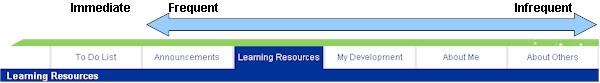
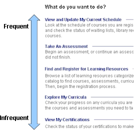
Below the To Do list is an introduction to the main sections (tabs) in the application. This provides brief but sufficient information about the types of tasks that can be performed for someone encountering the application for the first time. This information is located at the bottom of the page partly so that it does not encumber an experienced user. For first time users, they are likely to have very few items on a To Do list, so the information will be visible to them initially - it was also felt that they would be more motivated to scroll for useful overview information. Consistent navigation and menu pagesTabs and menus have been designed to reduce the need to hunt for desired activities and interpret available choices. The tabs along the top are organized in order of likely frequency of use, so the eye does not necessarily need to scan across the entire group before finding the desired action.
The same technique is applied for menu items, so tasks that are more frequently performed are nearer the top of the page. There is an implied focus on tasks that should be done regularly, which creates a sense of "process" for users as they manage their learning, even though the overall sequence of tasks is unstructured. This approach has the added benefit of reducing the need to scan the whole list, and also reduces the amount of mouse movement required in many cases.
The language used on the menu pages is:
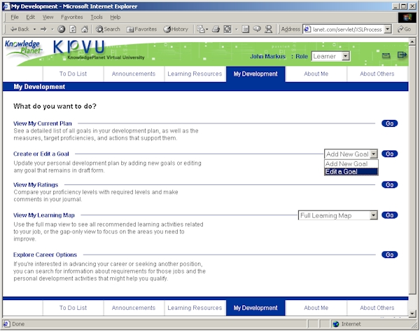
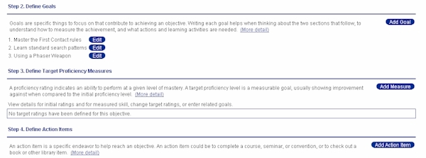
All actions relating to a particular tab are grouped on one page, with little or no scrolling. The layout makes the possible actions explicit. Users are able to quickly understand and find what they are looking for, even if it has been months since they performed a specific task. The layout does not prove to be a barrier to frequent users when selecting common actions. Submenus are presented as drop-downs, which reduces the number of clicks to begin an action and the number of pages that the user sees. The user's initial experience with "Go" buttons (along with the "Start" buttons on the To Do list) helps them understand quickly that buttons of that shape and style perform actions. No matter what the button is or where it is in the application, the consistent style makes it quickly familiar to them. Improved task sequencing and layoutWhere there are complex tasks that the user performs, additional support is provided through the use of titles and numbered sequences that structure a task. For example, constructing a personal development plan is an activity that is usually only done once or a few times a year. The design approach to support this task included:
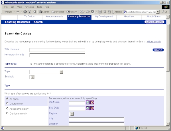
Searching the course catalog required a design approach that structures the task into increasing levels of detail. If a learner wants a simple search (by name), it is right at the top in its own section. Further levels of refinement are provided using section titling, and selections that only act in specific relationship to other fields are displayed with a background highlight that visually groups the items. When the search results are displayed, the search criteria are represented at the bottom of the same page, allowing quick refinement of a search if different results are desired.
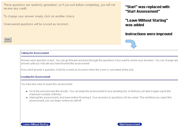
Even for less complex tasks, we improved sequencing through the use of consistent titles and the placement of elements on the page. The title at the top of each page indicates the purpose of the page and reinforces the users' understanding of where they are. Improved support (on-screen and help), including reduced jargonThe on-screen support was designed to provide the right amount of information incrementally. This encompassed everything from individual labels through to the creation of a new extendable help architecture. Buttons, field labels, and instructions were reviewed and clarified to provide a clearer indication of their function and the result the user could expect when the action was taken.
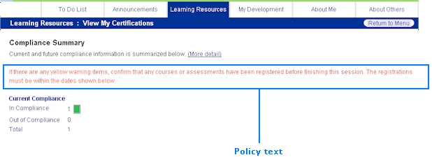
People want to quickly identify what they have to do, so brief instructions are presented at the top of each page to frame the goals and actions of the task. The information is kept to a minimum so as not to feel like a barrier to the task if it is not needed. The dynamically generated pages include a policy placeholder that allows customized text to be displayed. This means that policy information can be displayed on appropriate pages, allowing a customer to include business-specific guidance directly at the point where a task is being performed. The policy text is formatted differently from generic instruction in order to highlight it.
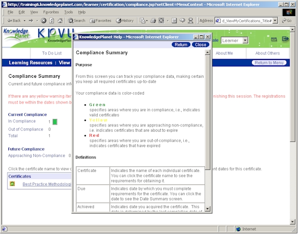
"More detail" is signaled within the on-screen text at particular points where it is relevant, so users don't have to go looking for a help icon or menu item. It links to a page of help information which is specific to the activity they are working on. The help information is editable (as html) and expandable, which is useful if customers want to provide further business-specific detail, or as features are added to the LMS application in the future.
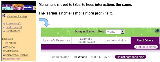
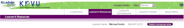
Distinct interface theme for managers/mentors and approversEveryone in an organization can be a "learner," but often people also have responsibilities for other people's learning as well as their own. In the KnowledgePlanet application this is embodied in the roles of Mentor/Manager and also Approver. Previously, the interface presented a single face to someone who had these additional responsibilities. The indicator of more responsibility was the addition of a "Mentor tab" at the top left of the interface. On selection, the user would encounter different menus on the left side of the application, but any selection of other tabs at the top would return the person to their own learning records. This sometimes created confusion: "am I working on my own records or someone else's?"
Now, a different color theme appears when the user switches from viewing their own information to viewing and acting on someone else's. The user is able to select from a range of different roles using a drop-down field (this way the available roles can expand over time without retraining the user).
When the mentor role is selected, the user is able to pick which person's records to view. They see that person's name and contact details prominently on every page, so there is never any confusion about who is affected by the actions the mentor is taking. The same menu structure and navigation are used in the mentor and learner modes, so there is no need for the mentors to learn a different navigation structure. Faster, simpler customer adaptation of the look-and-feelThe redesigned interface reduced the number of graphics, and removed all words that had been embedded in graphics. The design of the buttons to allow overlay of text labels from the text file (rather than created in the graphic) improved the look-and-feel while simplifying the customization task. The entire color and font theme for an implementation can be changed by modifying ten graphics and 8-12 settings in a configuration file, which is a significant time saving with a large customer base. Changing text and descriptions has also been made easier. Previously some text was hard-coded, but most of it was in a standard text file. Text was extracted into a database to help support the increase in the amount of text from the on-screen instruction. The database also allowed better editing and management of existing text, which carries forward to supporting customers during implementation and translation for international versions. Policy information can be added in the same way. Overall, there is a greater capability to efficiently customize and localize the product for both graphical "branding" and multiple language support. This helps the user feel that the application is familiar with little interpretation or learning… it is "talking their language."
KP2000: Learner Interface Redesign
|
||

|
© Duane Degler 2001-2008